
Review the key concepts, formulae, and examples before starting your quiz.
🔑Concepts
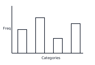
Data can be organized and presented visually using Bar Graphs, where the height of bars represents the frequency of discrete categories. The bars are of equal width with uniform spacing between them.
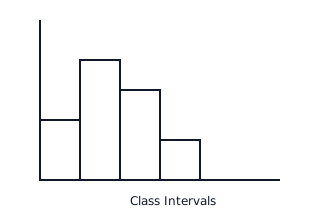
Histograms are used for continuous data grouped into class intervals. Unlike bar graphs, there are no gaps between the rectangles, and the area of each rectangle is proportional to its frequency. For equal class widths, height is proportional to frequency.
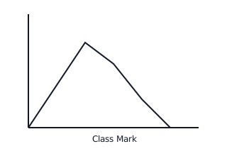
A Frequency Polygon is a line graph formed by joining the mid-points (class marks) of the upper sides of the rectangles in a histogram. It can also be drawn independently by plotting class marks against frequencies.
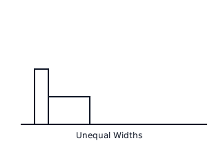
When class widths are unequal in a histogram, the heights of the rectangles must be adjusted so that the area (not just height) is proportional to the frequency. The adjusted frequency is calculated relative to the minimum class width.
📐Formulae
💡Examples
Problem 1:
Given the class interval with a frequency of , and the minimum class width in the entire data set being , calculate the length (height) of the rectangle for a histogram with unequal class widths.
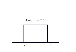
Solution:
Explanation:
To maintain area proportionality in a histogram with varying widths, we calculate adjusted frequency using the ratio of the current frequency to its width, scaled by the minimum width found in the distribution.
Problem 2:
Represent the following data using a frequency polygon: Class marks with corresponding frequencies .
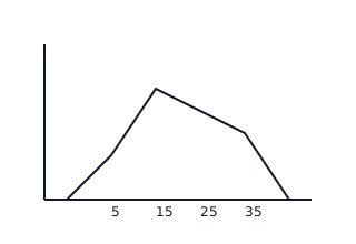
Solution:
- Plot points .
- To close the polygon, assume classes before and after with zero frequency: and .
- Connect points with straight lines.
Explanation:
Points are plotted using the class mark as the -coordinate and the frequency as the -coordinate. The polygon is 'closed' by connecting it to the horizontal axis at the midpoints of the preceding and succeeding imaginary classes.