
Review the key concepts, formulae, and examples before starting your quiz.
🔑Concepts
A stacked column chart (or subdivided bar diagram) is used to represent data where each bar represents a whole, and segments within the bar represent the components of that total. It is particularly useful for comparing the total size of categories while showing the internal breakdown.
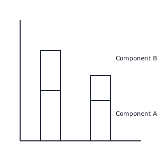
To construct a stacked column, determine the cumulative values for each category. If category has parts , , and , the first segment ends at , the second at , and the third at .

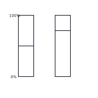
Stacked columns can also be expressed as 'Percentage Stacked Bars' where the total height of every bar is . This allows for a comparison of the relative proportions (shares) of components across different totals.
📐Formulae
💡Examples
Problem 1:
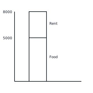
A family spends Rs 5000 on Food and Rs 3000 on Rent. Represent this as a stacked column chart where the total height reflects the total expenditure.
Solution:
- Calculate Total: .
- Draw a rectangle for 'Food' from base to height .
- Draw the next rectangle for 'Rent' starting at and ending at .
Explanation:
The stacked column shows that the total expenditure is Rs 8000. The portion of the bar from 0 to 5000 represents Food, and the portion from 5000 to 8000 represents Rent.
Problem 2:
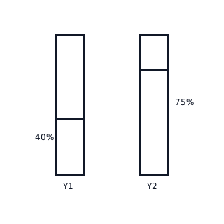
Convert the following production data for two years into a percentage stacked bar chart: Year 1 (Wheat: 40 tons, Rice: 60 tons), Year 2 (Wheat: 90 tons, Rice: 30 tons).
Solution:
For Year 1: Total = . Wheat = . Rice = . For Year 2: Total = . Wheat = . Rice = .
Explanation:
In a percentage stacked bar, all bars have a total height of 100 units. Year 1 shows a 40-60 split, while Year 2 shows a 75-25 split.