
Review the key concepts, formulae, and examples before starting your quiz.
🔑Concepts
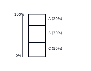
When comparing parts of a whole, a Pie Chart uses circular sectors where the central angle is proportional to the quantity. An alternative is the Segmented Bar Chart or Stacked Bar Chart, which represents the whole as a single bar of 100% height, divided into segments based on proportions.
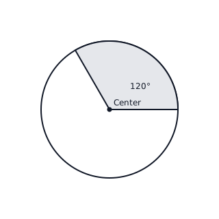
The central angle for a component in a pie chart is calculated by the formula: . This helps in visualizing the relative size of data points.
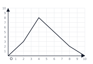
Data can also be visualized using Frequency Polygons. This is an alternative to histograms where mid-points of the upper sides of the rectangles are joined by line segments. It provides a clearer view of the 'shape' or 'distribution' of the data.
To compare two sets of data relative to a total, we use a Double Bar Graph. This allows side-by-side comparison of quantities across categories without losing the individual context of each data set.
📐Formulae
💡Examples
Problem 1:
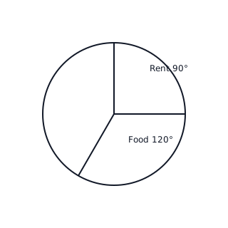
A student spends Rs 3600 per month. The expenses are: Food (Rs 1200), Rent (Rs 900), Education (Rs 600), and Others (Rs 900). Calculate the central angle for each category to represent this in a pie chart.
Solution:
Total Expenditure = Rs 3600. Food: Rent: Education: Others: Sum: .
Explanation:
To find the angle, we divide the specific expense by the total expense and multiply by the total degrees in a circle (360).
Problem 2:
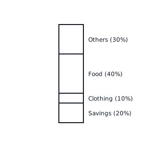
Represent the following percentage data of a family's budget as a segmented bar chart: Savings (20%), Clothing (10%), Food (40%), Others (30%).
Solution:
Draw a vertical bar of total length representing 100 units. Segment 1 (Savings): 0 to 20 units. Segment 2 (Clothing): 20 to 30 units (10%). Segment 3 (Food): 30 to 70 units (40%). Segment 4 (Others): 70 to 100 units (30%).
Explanation:
In a segmented bar chart, the height of each segment corresponds to its percentage of the total.