
Review the key concepts, formulae, and examples before starting your quiz.
🔑Concepts
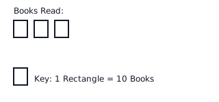
A Pictograph represents data using icons or symbols. A key is essential to define the numerical value assigned to a single symbol, allowing for the calculation of total quantities through multiplication. For example, if 1 book symbol equals books, then symbols represent books.
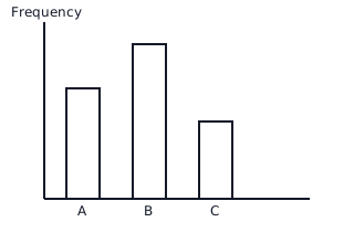
A Bar Graph uses rectangular bars of uniform width to compare different categories. The height (for vertical bars) or length (for horizontal bars) represents the frequency or value of each category. The axes must be labeled, and a consistent scale must be used.
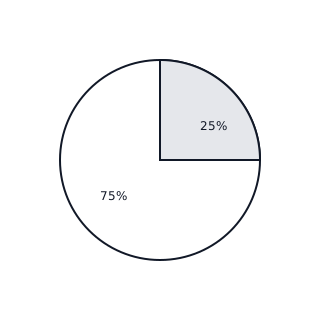
A Pie Chart (or Circle Graph) shows the relationship of parts to a whole. The entire circle represents or . Each sector's size is proportional to the quantity it represents, calculated using the central angle formula.
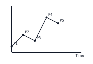
A Line Graph displays information as a series of data points called 'markers' connected by straight line segments. It is primarily used to track changes or trends over periods of time (e.g., temperature over a week).
📐Formulae
💡Examples
Problem 1:
In a survey of students, students chose 'Blue' as their favorite color. Calculate the central angle that represents 'Blue' in a pie chart.
Solution:
Step 1: Identify the given values. and . \nStep 2: Use the pie chart formula: . \nStep 3: Substitute the values: . \nStep 4: Simplify the fraction: . \nStep 5: Calculate the final angle: .
Explanation:
To represent a portion of data in a pie chart, we find the fraction of the total it occupies and multiply it by the total degrees in a circle ().
Problem 2:
A pictograph uses a symbol of a bicycle to represent bicycles sold. If a shop sells bicycles in a month, how many symbols must be drawn to represent this data?
Solution:
Step 1: Identify the Key. . \nStep 2: Determine the total sold: . \nStep 3: Divide the total by the key value: . \nStep 4: Perform the division: . \nStep 5: Interpret the result: The representation requires full bicycle symbols and half-bicycle symbol.
Explanation:
To find the number of symbols for a pictograph, divide the actual frequency by the value assigned to one symbol in the key. Decimal results (like ) are represented by drawing a partial symbol.
Problem 3:
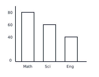
The following table shows the marks obtained by a student in three subjects: Math (), Science (), and English (). Represent this data using a vertical bar graph with a scale of unit = marks.
Solution:
- Determine the bar heights:
- Math: units
- Science: units
- English: units
- Draw the -axis for subjects and the -axis for marks.
- Draw the bars according to the calculated units.
Explanation:
In a bar graph, the height is directly proportional to the value. Since our scale is , we divide each score by to find the height in graph units.
Problem 4:
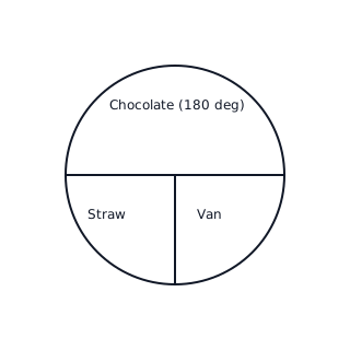
A baker sells cakes in total. The sales consist of: Chocolate (), Vanilla (), and Strawberry (). Create a pie chart to represent this data and find the central angle for the Chocolate sector.
Solution:
- Total Value:
- Central Angle for Chocolate:
- Central Angle for Vanilla/Strawberry:
- The Chocolate sector will be a semi-circle (), and the others will be quarter-circles ().
Explanation:
The central angle represents the proportion of the total. Since Chocolate is exactly half of the total sales ( out of ), its angle is half of , which is .