
Review the key concepts, formulae, and examples before starting your quiz.
🔑Concepts
A Bar Graph is a visual representation of data using rectangular bars of uniform width, where the lengths (or heights) of the bars represent the values of the categories being compared. The bars can be drawn vertically or horizontally.
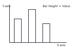
The 'Scale' is the ratio between the unit length of a bar and the actual value it represents. For example, if , a bar of represents students. This scale is usually shown on the vertical axis.
To interpret a bar graph, you read the height of each bar against the scale on the axis. The highest bar indicates the 'Maximum' value, while the shortest bar indicates the 'Minimum' value.
Data can be compared by calculating the difference between the heights of two bars or finding the total by summing the values of all bars represented in the graph.
📐Formulae
💡Examples
Problem 1:
A bar graph represents the number of bicycles sold by a shop in four days. The scale is . If the bar for Monday is long, the bar for Tuesday is long, and the bar for Wednesday is long, find the total number of bicycles sold in these three days.
Solution:
Step 1: Find the number of bicycles sold on each day using the formula .
- Monday:
- Tuesday:
- Wednesday: Step 2: Calculate the total by adding the daily values. Total = .
Explanation:
We first convert the visual units into actual data values by multiplying the height of each bar by the given scale factor, then sum the results to find the grand total.
Problem 2:
Observe a bar graph where the vertical axis represents 'Marks Obtained' and the horizontal axis represents 'Subjects'. If the bar for Mathematics reaches the mark and the bar for Science reaches the mark, how many more marks were obtained in Mathematics than in Science?
Solution:
Step 1: Identify the values from the graph.
- Marks in Mathematics =
- Marks in Science = Step 2: Calculate the difference to find how many 'more' marks were obtained. Difference = .
Explanation:
Interpretation involves reading the specific values associated with the height of the bars for the given categories and performing subtraction to find the comparative difference.
Problem 3:
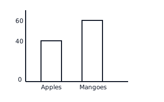
The following bar graph shows the number of fruits sold by a vendor in a day. If the scale is , find the total weight of Apples and Mangoes sold.
Solution:
Explanation:
Identify the units for Apples (4) and Mangoes (6) from the graph. Multiply these by the scale factor (10) to get actual weights, then add them together.
Problem 4:
Observe the bar graph showing the number of trees planted by students in three years. How many more trees were planted in 2022 than in 2021 if the scale is ?

Solution:
Explanation:
Subtract the value of the 2021 bar from the 2022 bar. Since 2022 is at 8 units and 2021 is at 5 units, the difference is , which equals trees.