
Review the key concepts, formulae, and examples before starting your quiz.
🔑Concepts
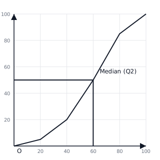
Cumulative frequency is the running total of frequencies. When plotted against the upper class boundaries, it forms an 'S-shaped' curve called an ogive. This curve allows us to estimate the median (), lower quartile (), and upper quartile () by finding the values corresponding to , , and on the vertical axis.
A Box Plot (or Box-and-Whisker Plot) provides a visual summary of the five-number summary: Minimum, Lower Quartile (), Median (), Upper Quartile (), and Maximum. The 'box' represents the Interquartile Range (), containing the middle of the data.
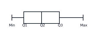
The Interquartile Range () is a measure of spread that is less affected by outliers than the total range. A smaller indicates that the data is more consistent or less varied around the median.
Percentiles divide the data into 100 equal parts. For example, the percentile is the value below which of the data falls. It is found at the cumulative frequency position of .
📐Formulae
💡Examples
Problem 1:
A group of 80 students took a math test. The results are: (freq: 10), (freq: 20), (freq: 35), (freq: 15). Calculate the cumulative frequencies and identify the position of the median.
Solution:
- CF for is 10.
- CF for is .
- CF for is .
- CF for is . Median Position: value.
Explanation:
To find cumulative frequency, we keep a running total. The median position in a continuous data set of items is found at . To find the actual median score, you would locate 40 on the y-axis of a CF graph and read the corresponding x-value.
Problem 2:
From a cumulative frequency graph, the following values were found: Min = 12, , Median = 34, , Max = 58. Construct the description of the box plot.
Solution:
The box starts at 25 and ends at 42. A vertical line is drawn inside the box at 34. Whiskers extend from the box left to 12 and right to 58.
Explanation:
A box plot visually represents the five-number summary. The 'box' covers the IQR ( to ), and the 'whiskers' cover the full range of the data.
Problem 3:
Compare two sets of data: Class A has a Median of 65 and IQR of 10. Class B has a Median of 60 and IQR of 20. Which class performed better and which was more consistent?
Solution:
Class A performed better on average (higher Median: 65 > 60). Class A was also more consistent (lower IQR: 10 < 20).
Explanation:
In IGCSE statistics, 'better performance' is indicated by a higher median, while 'consistency' or 'reliability' is indicated by a smaller Interquartile Range (less spread in the middle 50% of data).
Problem 4:
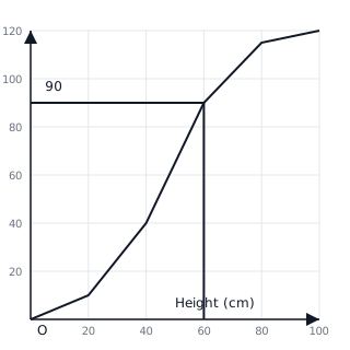
The cumulative frequency graph shows the heights of plants. Use the graph to estimate the number of plants with a height greater than cm.
Solution:
- Locate cm on the horizontal (height) axis.
- Move vertically to meet the curve, then horizontally to the vertical (cumulative frequency) axis.
- The cumulative frequency value at cm is .
- This means plants have a height cm.
- Number of plants cm is plants.
Explanation:
To find 'greater than' values, subtract the cumulative frequency at that point from the total frequency ().
Problem 5:
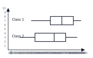
Compare the distribution of test scores for two classes using the box plots provided. Which class has a higher median and which class has more spread in the middle of scores?
Solution:
- Class 1 Median (line inside box) is at . Class 2 Median is at . Therefore, Class 1 has a higher median score.
- Spread in the middle is represented by the length of the box ().
- Class 1 . Class 2 .
- Class 2 has a larger , so it has more spread in the middle of scores.
Explanation:
Higher median indicates better typical performance. Larger IQR indicates lower consistency in the central data.