
Review the key concepts, formulae, and examples before starting your quiz.
🔑Concepts
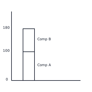
A stacked bar graph represents multiple sub-categories of data for a single entity as segments within a single bar. The total height of the bar corresponds to the sum of all individual values. To find the value of a specific segment, subtract its lower boundary value from its upper boundary value: .
A 100% stacked bar graph shows the relative proportion of each category within a whole. Every bar is normalized to the same total height representing . This graph is useful for comparing the percentage distribution across different groups, regardless of the absolute size of the groups.
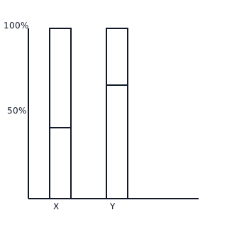
When interpreting data, look for changes in the 'mix' of components. In a stacked bar, if the total height increases but one segment remains the same height, that segment's percentage contribution to the whole has decreased.
Stacked bar graphs are preferred over multiple separate bar graphs when the total volume (the sum) is as important as the individual contributions of the components.
📐Formulae
\text{Total Percentage for any bar in 100% Stacked Graph} = 100\%
💡Examples
Problem 1:
A stacked bar graph shows the production of Wheat and Rice in two years. In 2022, the Wheat segment starts at and ends at units, and the Rice segment ends at units. In 2023, the Wheat segment ends at units and the Rice segment ends at units. Which year had higher Rice production?
Solution:
For 2022: Rice production = units.
For 2023: Rice production = units.
Since , the year 2023 had higher Rice production.
Explanation:
To find the value of a stacked segment that does not start at the origin, subtract the value at the start of the segment from the value at the end of the segment.
Problem 2:
A 100% stacked bar graph shows that in School A, of students are Boys, while in School B, of students are Boys. If School A has students and School B has students, which school has more Girls?
Solution:
School A Girls Percentage: .
Number of Girls in School A: .
School B Girls Percentage: .
Number of Girls in School B: .
School B has more girls.
Explanation:
Even though School A might look like it has a 'larger' segment if only looking at percentages, the absolute number depends on the total population of each category (school).
Problem 3:
Calculate the total revenue from a stacked bar where 'Product X' contributes and 'Product Y' is represented by a segment starting at and ending at .
Solution:
The total revenue is the value at the top of the bar, which is .
Explanation:
In a sub-divided/stacked bar graph, the top-most point on the y-axis for a bar represents the cumulative total of all components in that bar.
Problem 4:
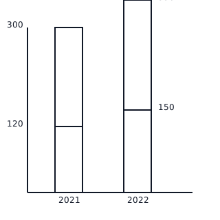
The following stacked bar graph represents the number of students enrolled in 'Art' and 'Science' courses over two years. In 2021, the Art segment ends at and the Science segment ends at . In 2022, the Art segment ends at and the Science segment ends at . Calculate the increase in the number of Science students from 2021 to 2022.
Solution:
- In 2021, the Art segment goes from to . The Science segment starts at and ends at .
- Science students (2021) = .
- In 2022, the Art segment goes from to . The Science segment starts at and ends at .
- Science students (2022) = .
- Increase in Science students = .
Explanation:
To find individual component values in a stacked bar graph, we calculate the difference between the top and bottom values of that specific component's segment.
Problem 5:
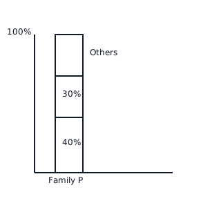
A 100% stacked bar graph compares the expenditure of two families. Family P spends on Food, on Rent, and the rest on Others. Family Q spends on Food, on Rent, and the rest on Others. If Family P's total expenditure is Rs , find the absolute amount they spend on 'Others'.
Solution:
- For Family P, the total percentage is always .
- Percentage spent on 'Others' =
- Percentage for Others = .
- Absolute amount spent on Others = of Rs .
- Amount = .
- Family P spends Rs on Others.
Explanation:
In a 100% stacked bar graph, we first determine the percentage of the segment of interest and then apply it to the total value provided for that specific bar.