
Review the key concepts, formulae, and examples before starting your quiz.
🔑Concepts
Data collection is the process of gathering information from various sources. Primary data is collected by the investigator personally for a specific purpose, while secondary data is obtained from existing sources like newspapers or government reports.

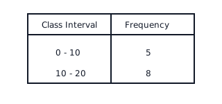
Frequency Distribution Tables organize raw data into categories. In a grouped frequency distribution, data is divided into class intervals. For continuous data (Exclusive form), an observation equal to the upper limit of an interval is included in the next higher interval.
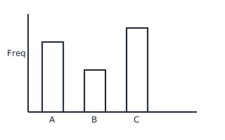
A Bar Graph is a pictorial representation of data using bars of uniform width drawn horizontally or vertically with equal spacing. The height (or length) of the bars represents the frequency of the data values.
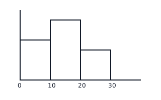
A Histogram is used for representing continuous grouped frequency distributions. Bars are drawn adjacent to each other with no gaps. The area of each rectangle is proportional to the frequency. If class widths are unequal, frequencies must be adjusted.
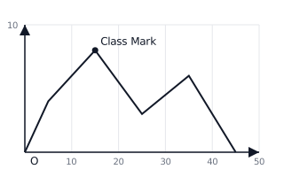
A Frequency Polygon is a line graph used for representing frequency distributions. It is obtained by joining the mid-points (class marks) of the upper sides of the rectangles in a histogram, or by plotting mid-points against frequencies directly.
📐Formulae
💡Examples
Problem 1:
The marks obtained by 10 students in a mathematics test are: . Construct a frequency distribution table and find the range.
Solution:
- Arrange the data in ascending order: .
- Count the frequency of each observation:
- : times
- : times
- : times
- : time
- : time
- Create the table with columns 'Marks' and 'Frequency'.
- Calculate Range:
Explanation:
To organize raw data, we first count how many times each value appears (frequency). The range shows the difference between the highest and lowest scores.
Problem 2:
In a grouped frequency distribution, the class intervals are . Find the class mark for the interval and the class size.
Solution:
- To find the Class Mark ():
- To find the Class Size ():
Explanation:
The class mark is the central value of a class interval, used for plotting frequency polygons. The class size is the uniform width of the intervals.
Problem 3:
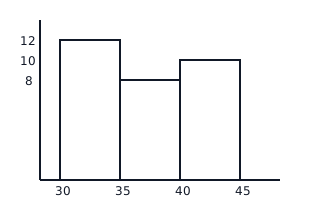
Represent the following distribution of weights of 30 students using a histogram: kg ( students), kg ( students), kg ( students).
Solution:
- Mark Class Intervals on the x-axis ().
- Mark Frequencies on the y-axis (up to ).
- Draw adjacent rectangles with heights corresponding to frequencies:
- Interval : height
- Interval : height
- Interval : height
Explanation:
Since the class intervals are continuous and have equal width, we draw a histogram where the height of each bar represents the frequency of the respective class interval.
Problem 4:
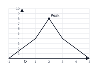
Construct a frequency polygon for the data representing the number of goals scored by a team in 20 matches: 0 goals (2 matches), 1 goal (4 matches), 2 goals (8 matches), 3 goals (4 matches), 4 goals (2 matches).
Solution:
- The class marks are the scores themselves: .
- Plot the points: .
- Connect the points with straight lines.
- To close the polygon, imagine classes with zero frequency at both ends: and .
Explanation:
A frequency polygon is created by plotting the frequency against the variable (or class mark) and joining the resulting points with straight line segments.