
Review the key concepts, formulae, and examples before starting your quiz.
🔑Concepts
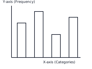
A Bar Graph is a pictorial representation of discrete data using rectangular bars of uniform width with equal spacing between them. The height or length of each bar is proportional to the frequency of the variable it represents.
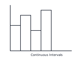
A Histogram is used for continuous frequency distributions. Unlike bar graphs, there are no gaps between the bars. The area of the rectangles is proportional to the frequencies. If class intervals are unequal, Frequency Density is used for height.
The 'Kink' or Zig-Zag line: When the scale on the horizontal axis does not start from the origin (), a kink (broken line) is drawn near the origin to indicate that a portion of the axis has been omitted.
Class Boundaries: To convert inclusive distributions (e.g., ) into exclusive ones (continuous), we subtract from the lower limit and add to the upper limit of each class.
📐Formulae
💡Examples
Problem 1:
Given the class intervals , find the class mark for the third class and the class size.
Solution:
- Identify the third class interval: .
- Identify limits: Lower Limit () = , Upper Limit () = .
- Calculate Class Mark: .
- Calculate Class Size: .
Explanation:
The class mark is the average of the boundaries, and the class size is the uniform width of the intervals used for the histogram base.
Problem 2:
The weights (in kg) of 5 students are: . Calculate the range of this data.
Solution:
- Find the Maximum value: .
- Find the Minimum value: .
- Apply Range formula: .
- Calculate: . Result: The range is kg.
Explanation:
Range gives the spread of the data, which helps in deciding the scale for the axes when drawing a bar graph or histogram.
Problem 3:
Construct a bar graph to represent the number of students who joined different hobby clubs: Music (), Dance (), Sports (), and Art ().
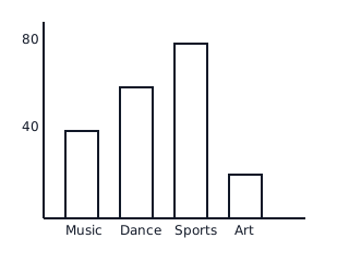
Solution:
- Draw two perpendicular lines (X and Y axes).
- Represent 'Clubs' on the X-axis and 'Number of Students' on the Y-axis.
- Take a scale: unit = students.
- Draw bars of heights units respectively with equal gaps.
Explanation:
Since the data is categorical (discrete), a bar graph with gaps is the correct representation. The height of the 'Sports' bar is the highest at .
Problem 4:
Draw a histogram for the following distribution of marks: ( students), ( students), ( students), and ( students).
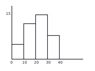
Solution:
- The intervals are continuous (exclusive type).
- Mark the class intervals on the X-axis and frequency on the Y-axis.
- Scale: cm on Y-axis = students.
- Draw adjacent rectangles with heights proportional to .
Explanation:
Because the data represents continuous marks, we use a histogram where bars touch each other. The width of each bar corresponds to the class size ().