
Statistics and Probability - Graphical Representation of Data (Bar Graphs, Histograms, Pie Charts)
Review the key concepts, formulae, and examples before starting your quiz.
🔑Concepts
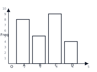
Bar Graphs: These are used for comparing discrete categories. The height or length of each bar represents the frequency of that category. Bars should have equal width and should be separated by equal gaps.
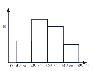
Histograms: Unlike bar graphs, histograms are used for continuous data grouped into intervals. There are no gaps between the bars because the data is continuous. The area of each bar is proportional to the frequency.
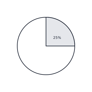
Pie Charts: A circular representation where the circle is divided into sectors. Each sector represents a proportion of the whole. The central angle of a sector is calculated by dividing the category's frequency by the total frequency and multiplying by .
Data Interpretation: Visual representations allow us to identify the 'Mode' (the most frequent category shown by the highest bar or largest sector) and 'Trends' (increasing or decreasing patterns in data over intervals).
📐Formulae
💡Examples
Problem 1:
A group of students was surveyed about their favorite sports. students chose Football, chose Basketball, chose Swimming, and chose Tennis. Calculate the central angles required to represent this data in a pie chart.
Solution:
- Identify the total frequency: .
- Calculate the angle for Football: .
- Calculate the angle for Basketball: .
- Calculate the angle for Swimming: .
- Calculate the angle for Tennis: .
- Verification: .
Explanation:
Each frequency is converted into a fraction of the total population (). This fraction is then multiplied by to find the portion of the circle the category occupies.
Problem 2:
The heights (in cm) of seedlings are recorded: . Create a frequency table with class intervals of width and describe the resulting histogram.
Solution:
- Group the data into intervals:
- : (Frequency = )
- : (Frequency = )
- : (Frequency = )
- : (Frequency = )
- The x-axis will be labeled with the boundaries .
- The y-axis will show frequencies from to .
- Four bars will be drawn with heights respectively, touching each other to show continuity.
Explanation:
Since height is continuous data, a histogram is used. Data is sorted into 'bins' or intervals. The equal width of the intervals () ensures that the height of each bar accurately represents the frequency of seedlings in that height range.
Problem 3:
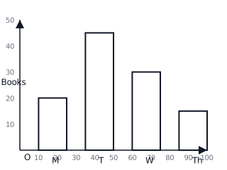
A school library tracks the number of books borrowed over four days: Monday: , Tuesday: , Wednesday: , Thursday: . Represent this data using a bar graph.
Solution:
- Label the x-axis with the Days (Monday, Tuesday, Wednesday, Thursday).
- Label the y-axis with the Number of Books (frequency) using a scale of units.
- Draw bars for each day: Monday , Tuesday , Wednesday , Thursday .
Explanation:
A bar graph is chosen here because the days are discrete categories. The heights clearly show that Tuesday was the busiest day for borrowing books.
Problem 4:
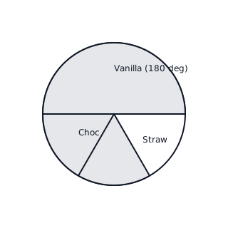
In a survey of people, preferred Vanilla, preferred Chocolate, and preferred Strawberry. Calculate the sector angles for a pie chart and represent the data.
Solution:
Total Vanilla angle: Chocolate angle: Strawberry angle: Sum of angles:
Explanation:
Since Vanilla is exactly half of the total (), it occupies a semi-circle (). The remaining half is split between Chocolate and Strawberry in a ratio.