
Review the key concepts, formulae, and examples before starting your quiz.
🔑Concepts
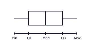
A Box-and-Whisker Plot provides a visual summary of data using five key values: the Minimum, lower quartile (), Median (), upper quartile (), and Maximum. The 'box' spans the Interquartile Range (), containing the middle of the data.
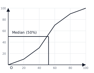
A Cumulative Frequency Graph (Ogive) is used to estimate the median and quartiles. It is created by plotting the running total of frequencies against the upper class boundaries of data intervals.
The Interquartile Range () represents the spread of the middle of the data, calculated as . It is a measure of variability that is less influenced by outliers than the total range.
Percentiles divide data into 100 equal parts. The percentile is the value below which of the data falls. For example, is the percentile and is the percentile.
📐Formulae
💡Examples
Problem 1:
Given the following data set of test scores: . Find the five-number summary and the .
Solution:
- Arrange in order (already done): .
- Minimum: , Maximum: .
- Median (): The middle value is the term, so .
- Lower Quartile (): The median of the lower half () is .
- Upper Quartile (): The median of the upper half () is .
- .
Explanation:
The five-number summary provides the bounds for the box-and-whisker plot. The tells us the spread of the middle half of the students' scores is marks.
Problem 2:
A group of students took a math quiz. The cumulative frequency graph shows that the student (at the percentile) scored marks and the student (at the percentile) scored marks. Calculate the for these marks.
Solution:
From the data provided:
- (25th percentile) =
- (75th percentile) =
Explanation:
In a cumulative frequency graph, percentiles are used to find quartiles. The is the difference between the and percentiles.
Problem 3:
Calculate the cumulative frequencies for the following frequency table:
Solution:
To find cumulative frequency ():
- For :
- For :
- For :
Final Table:
Explanation:
Cumulative frequency is calculated by summing the frequencies up to the current interval. These values are plotted against the upper bounds () to draw the graph.
Problem 4:
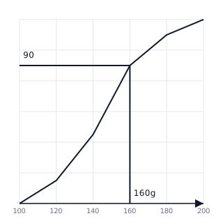
A researcher records the weights of 120 apples in grams. The cumulative frequency graph of the data is shown. Use the graph to estimate the number of apples that weigh more than grams.
Solution:
- Find the value on the x-axis (Weight).
- Move vertically to hit the curve, then horizontally to the y-axis (Cumulative Frequency).
- The cumulative frequency at is .
- This means apples weigh g or less.
- To find those weighing more than g: Total - Cumulative Frequency = .
Answer: apples.
Explanation:
To find the count of items 'above' a certain value, you subtract the cumulative frequency at that point from the total frequency ().
Problem 5:
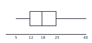
Given a data set with a Minimum of , of , Median of , of , and Maximum of . Draw the box-and-whisker plot and determine the Interquartile Range ().
Solution:
- Draw a number line from to .
- Draw a rectangle (the box) from to .
- Draw a vertical line inside the box at (Median).
- Extend whiskers from down to and from up to .
- Calculate :
Answer: .
Explanation:
The box covers the range between the quartiles, and the whiskers connect the box to the extremes of the data.