
Review the key concepts, formulae, and examples before starting your quiz.
🔑Concepts
A Bar Graph is a visual representation of data using rectangular bars of uniform width. The length or height of each bar represents the numerical value of the specific data category it denotes.
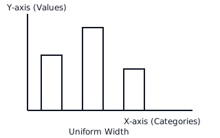
The 'Scale' is a crucial choice in drawing bar graphs. It defines how many units of data one unit of length (usually ) on the graph represents. For example, .
Interpretation involves reading the height of a bar against the Y-axis to find its value. Comparison between categories is done by observing the relative differences in bar heights.
Spacing between bars must be kept uniform to ensure the graph is clear and easy to read. Usually, the gap between bars is the same as the width of the bars themselves.
📐Formulae
💡Examples
Problem 1:
The following data shows the number of students who joined different hobby clubs in a school: Music: , Dance: , Art: , Drama: . Choose a suitable scale and determine the length of the bars for each category if .
Solution:
- Choose the Scale: Given .
- Calculate Bar Heights:
- For Music:
- For Dance:
- For Art:
- For Drama:
- Drawing: Draw the -axis for 'Clubs' and -axis for 'Number of Students'. Mark points at on the -axis. Draw rectangular bars of the calculated heights with equal width and spacing.
Explanation:
To represent the data correctly, we divide each actual value by the scale factor to find the corresponding height of the bar in units. This ensures the graph is proportional.
Problem 2:
A bar graph shows the sale of cars in four months. The scale is . The heights of the bars are: Jan: , Feb: , Mar: , Apr: . Find the total number of cars sold in these four months.
Solution:
- Find individual values using the scale:
- Jan:
- Feb:
- Mar:
- Apr:
- Calculate Total Sale: Total cars sold = .
Explanation:
Interpretation involves converting the visual bar lengths back into actual numerical data using the multiplication rule of the scale, then performing the required arithmetic operation (addition in this case).
Problem 3:
The marks obtained by a student in five subjects out of are: Hindi: , English: , Maths: , Science: , and S.St: . Represent this data using a bar graph with a scale of .
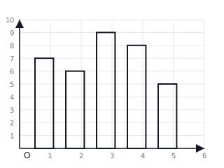
Solution:
- Identify the subjects for the X-axis and marks for the Y-axis.
- Scale: .
- Calculate bar heights: Hindi , English , Maths , Science , S.St .
- Draw the bars with uniform width and equal spacing.
Explanation:
By choosing a scale of , we convert the raw data into manageable unit lengths (e.g., for marks), making the graph proportional and easy to interpret.
Problem 4:
A bar graph shows the number of trees planted by a housing society over four years. In trees, trees, trees, and trees. Determine the total number of trees planted in the last two years and the year with maximum plantation.
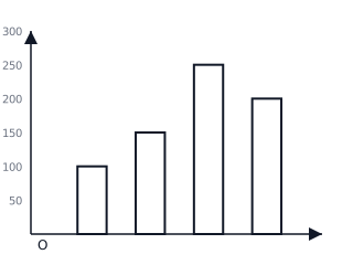
Solution:
- From the data: Trees in and Trees in .
- Total for last two years trees.
- Comparing all years: is the highest value, which occurred in .
Explanation:
Interpretation involves identifying the value of each bar. To find the total for specific categories, we sum their individual values. To find the maximum, we look for the tallest bar.