
Review the key concepts, formulae, and examples before starting your quiz.
🔑Concepts
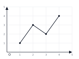
Line graphs are used to show how data changes over time. They are created by plotting points on a grid and connecting them with straight line segments.
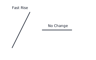
The steepness of the line (gradient) indicates the rate of change. A steeper line means a faster increase or decrease, while a horizontal line shows no change ( change) over time.
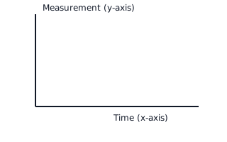
The x-axis usually represents the independent variable (often time, such as hours, days, or months), and the y-axis represents the dependent variable (the quantity being measured).
When interpreting a graph, look for trends: an upward trend shows growth, while a downward trend shows a decrease. Fluctuations indicate inconsistent change.
📐Formulae
💡Examples
Problem 1:
A line graph shows a plant's height was 4 cm on Monday and 10 cm on Friday. What was the growth over these 5 days?
Solution:
Explanation:
To find the change or growth, subtract the starting value (Monday) from the ending value (Friday). The plant grew 6 cm.
Problem 2:
You are plotting temperature data where the highest temperature is 35°C. If your Y-axis has 7 major grid squares, what should each interval represent?
Solution:
Explanation:
Divide the maximum value by the number of squares available to find a suitable scale. Each grid line should represent 5°C.
Problem 3:
In a graph representing a car's journey, the line is perfectly horizontal between 2:00 PM and 2:30 PM. What does this tell you about the car's movement?
Solution:
The car was stationary (stopped).
Explanation:
A horizontal line on a distance-time graph indicates that the distance is not changing as time passes, meaning the object is at rest.
Problem 4:
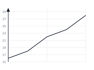
The following graph shows the temperature recorded in a garden from 8 AM to 12 PM. What is the difference between the temperature at 9 AM and 11 AM?
Solution:
- At 9 AM (x=1), the temperature is °C.
- At 11 AM (x=3), the temperature is °C.
- °C.
Explanation:
To find the difference, locate the time on the x-axis, find the corresponding y-value on the line, and subtract the smaller value from the larger one.
Problem 5:
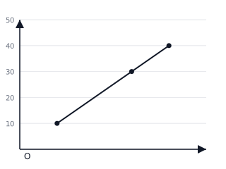
A water tank is being filled. The depth of water at 1 minute is cm and at 4 minutes it is cm. If the filling rate is constant, draw the line and determine the depth at 3 minutes.
Solution:
- Plot point and point .
- Connect the points with a straight line.
- Locate minutes on the x-axis and read the y-value: cm.
Explanation:
Since the rate is constant, the graph is a straight line. We can use the plotted line to 'interpolate' (find values within the data range).