
Review the key concepts, formulae, and examples before starting your quiz.
🔑Concepts
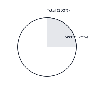
A Pie Chart (or Circle Graph) represents data as slices of a circle. The size of each slice or sector is proportional to the quantity it represents. The entire circle represents the total value ( or whole).
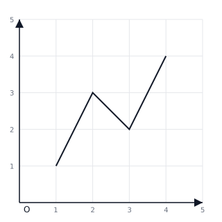
A Line Graph shows how a particular quantity changes over time. It is created by plotting points on a grid (with an -axis for time and a -axis for value) and connecting them with straight lines to show trends like increase, decrease, or stability.
In a pie chart, sectors can be identified by their fractional parts. For example, a sector covering half the circle represents of the total data, while a quarter represents .
When reading a line graph, the horizontal line (x-axis) usually represents independent variables like days, months, or years, and the vertical line (y-axis) represents the data being measured.
📐Formulae
💡Examples
Problem 1:
In a survey of students, students chose Chocolate as their favorite ice cream flavor, chose Vanilla, and chose Strawberry. Calculate the fraction for each flavor to represent them in a Pie Chart.
Solution:
- Find the total number of students: .
- Calculate the fraction for Chocolate: .
- Calculate the fraction for Vanilla: .
- Calculate the fraction for Strawberry: .
- Verification: .
Explanation:
To represent data in a Pie Chart, we find the part-to-whole ratio for each category. Here, Chocolate takes up half the circle (), while Vanilla and Strawberry each take up a quarter of the circle ( each).
Problem 2:
A plant's height was measured over three weeks. Week 1: cm, Week 2: cm, and Week 3: cm. Describe the trend of the line graph.
Solution:
- Identify the points on the graph: , , and .
- Plot the points and connect them.
- The segment from Week 1 to Week 2 rises by cm.
- The segment from Week 2 to Week 3 rises by cm.
- Since the line always moves upwards from left to right, the trend is a continuous increase.
Explanation:
A Line Graph shows change over time. By looking at the upward slope between the points, we can conclude that the plant is growing, and the growth rate actually increased between the second and third weeks.
Problem 3:
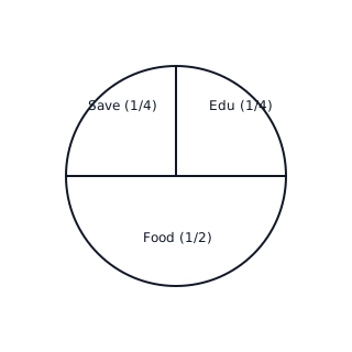
A family spends their monthly income of Rs on various needs. The pie chart shows that Food accounts for of the expenditure, Education for , and Savings for the remaining . Calculate the amount spent on Education.
Solution:
Total Income = Rs Fraction for Education = Amount spent on Education = Amount = Rs
Explanation:
To find the value of a sector, multiply the fraction representing that sector by the total value of the data.
Problem 4:
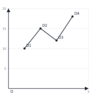
The following data shows the temperature recorded at 6 AM over four days: Day 1: C, Day 2: C, Day 3: C, Day 4: C. Represent this on a line graph.
Solution:
- Plot points: .
- Join the points with straight line segments.
- Observe the trend: The temperature rises from Day 1 to Day 2, falls on Day 3, and rises again on Day 4.
Explanation:
A line graph helps visualize the rise and fall of temperature over a specific period.