
Review the key concepts, formulae, and examples before starting your quiz.
🔑Concepts
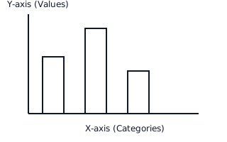
A bar graph consists of horizontal or vertical rectangular bars. The length or height of these bars is proportional to the values they represent, making it easy to compare different categories visually.
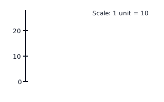
The 'Scale' of a bar graph determines how many units of actual data each division on the axis represents. For example, if , a bar of height units represents students.
Bar graphs must have clear labels. The Title describes what the graph is about, the X-axis labels the categories, and the Y-axis labels the numerical values or frequency.
Vertical bars are most common, where the height shows the value. However, horizontal bars can also be used, where the length of the bar extending to the right shows the value.
📐Formulae
💡Examples
Problem 1:
The following data shows the number of ice cream cones sold in a week: Vanilla (), Chocolate (), and Strawberry (). If a bar graph is drawn with a scale of , how many units high will the bar for 'Chocolate' be, and what is the total number of cones sold?
Solution:
Step 1: Identify the value for Chocolate, which is cones. Step 2: Use the scale formula: units. Step 3: Calculate the total number of cones: cones. Step 4: The Chocolate bar will be units high and the total sales are cones.
Explanation:
We divide the specific category value by the scale factor to find the physical height of the bar on the graph paper and add all values for the total.
Problem 2:
In a school library, there are Mystery books, Science books, and History books. In a bar graph representing this, how much taller (in units) is the Mystery bar than the History bar if the scale is ?
Solution:
Step 1: Find the height of the Mystery bar: units. Step 2: Find the height of the History bar: units. Step 3: Find the difference in units: units. Step 4: Alternatively, find the difference in books first: books, then convert to units: units.
Explanation:
The difference in the visual height of bars corresponds directly to the difference in the actual data values divided by the chosen scale.
Problem 3:
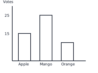
A group of friends voted for their favorite fruit. The results were: Apple (15), Mango (25), and Orange (10). Draw a bar graph using a scale of and determine the total number of votes cast.
Solution:
- Identify heights: Apple: Mango: Orange:
- Calculate Total: .
Explanation:
To represent the data, we divide each value by the scale factor (). The Mango bar will be the tallest at units because it has the highest frequency.
Problem 4:
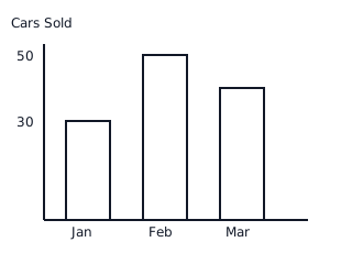
The bar graph shows the number of cars sold by a dealer over three months. In January, cars were sold, in February cars, and in March cars. What is the difference in sales between the highest and lowest selling months?
Solution:
- Identify values: Highest month (February) = Lowest month (January) =
- Subtract: .
Explanation:
By looking at the bar heights, February is the tallest bar () and January is the shortest bar (). The difference is .