
Review the key concepts, formulae, and examples before starting your quiz.
🔑Concepts
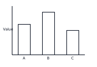
A Bar Graph uses rectangular bars of different heights to represent data. The length of each bar is proportional to the value it represents, allowing for quick visual comparisons between categories.
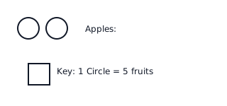
A Pictogram uses symbols or pictures to represent a specific quantity of data. A 'Key' or 'Legend' is essential to explain what each symbol stands for, such as symbol items.
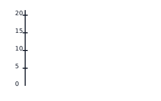
The Scale of a graph determines the intervals on the axis. For example, a scale might count by , , or . Choosing the right scale ensures the data fits well on the page.
Data Interpretation involves reading the graph to find specific information, such as identifying the 'Most Popular' category (highest bar) or the 'Least Popular' (shortest bar).

📐Formulae
💡Examples
Problem 1:
In a pictogram about favorite ice cream flavors, the Key states: ice cream cone symbol children. If the 'Vanilla' category has full symbols and half-symbol, how many children chose Vanilla?
Solution:
Step 1: Identify the value of a full symbol from the key: . Step 2: Calculate the value of the half-symbol: . Step 3: Calculate the total for full symbols: . Step 4: Add the half-symbol value to the total: .
Explanation:
To solve pictogram problems, first look at the key. Multiply the number of whole symbols by the value in the key, then add the fractional value of any partial symbols.
Problem 2:
A bar graph shows the number of books read by three students: Maya read books, Arjun read books, and Sam read books. If the scale on the y-axis goes up in intervals of , how much higher will Sam's bar be compared to Arjun's bar?
Solution:
Step 1: Find the value for Sam: . Step 2: Find the value for Arjun: . Step 3: Calculate the difference in books: . Step 4: Determine the difference in 'bar segments' based on the scale: Since each interval is , the height difference is .
Explanation:
The problem asks for the comparison between two bars. We find the numerical difference first (). Since the graph's scale increments by units per grid line, Sam's bar will be grid lines higher than Arjun's.
Problem 3:
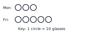
A juice shop tracks the number of orange juices sold in a week using a pictogram. The key says: Orange symbol glasses. If Monday shows full symbols and Friday shows full symbols, how many more glasses were sold on Friday than on Monday?
Solution:
Explanation:
First, calculate the total glasses for each day. Monday: glasses. Friday: glasses. The difference is glasses. Alternatively, find the difference in symbols first: symbols. Since each symbol represents , the difference is glasses.
Problem 4:
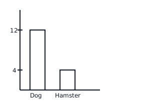
Look at the bar graph showing students' favorite pets. How many more students prefer Dogs than Hamsters if the scale on the y-axis is ?
Solution:
Explanation:
Find the top of the 'Dog' bar and align it with the y-axis to see it represents students. Find the top of the 'Hamster' bar to see it represents students. To find how many more, subtract: students.