
Review the key concepts, formulae, and examples before starting your quiz.
🔑Concepts
A histogram is a graphical representation of a frequency distribution in the form of rectangles. If class intervals are continuous, rectangles are adjacent. The width of each rectangle equals the class size , and the area is proportional to the frequency. For unequal class intervals, height is proportional to Frequency Density.
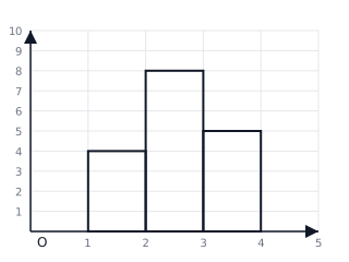
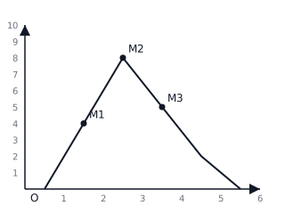
A Frequency Polygon is formed by joining the midpoints of the tops of the rectangles in a histogram with straight lines. To complete the polygon at both ends, it is extended to the class marks of the imaginary classes with zero frequency preceding the first class and following the last class.
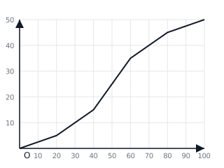
An Ogive (Cumulative Frequency Curve) is a graph representing cumulative frequency. In a 'Less Than' ogive, points are plotted with Upper Class Limits as -coordinates and Cumulative Frequencies as -coordinates. The curve is always non-decreasing and takes an S-shape.
For discontinuous class intervals (e.g., ), an adjustment factor must be calculated to make them continuous () before drawing a histogram or ogive. This ensures no gaps exist between the boundaries of consecutive classes.
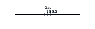
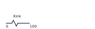
A 'Kink' or Zig-Zag line is used on the horizontal axis (-axis) if the first class interval does not start from zero. This indicates that the scale has been broken to skip the empty region between the origin and the first data point.
📐Formulae
💡Examples
Problem 1:
Given the following frequency distribution, calculate the class marks and draw a frequency polygon without using a histogram: Class Intervals: Frequencies:
Solution:
Step 1: Calculate the Class Marks for each interval. For : For : For : For :
Step 2: Identify the points to plot as :
Step 3: To close the polygon, find mid-points of preceding and succeeding classes: Preceding: mid-point is . Point Succeeding: mid-point is . Point
Step 4: Plot points to on a graph and connect them with straight lines.
Explanation:
To draw a frequency polygon without a histogram, the class marks are treated as the -coordinates. Closing the polygon by extending it to the -axis ensures the total area under the polygon remains equivalent to the area of the corresponding histogram.
Problem 2:
Construct a 'Less Than' Ogive for the following data: Marks: Frequency:
Solution:
Step 1: Construct the Cumulative Frequency (CF) table. Marks : Marks : Marks : Marks :
Step 2: Identify the coordinates to plot:
Step 3: Also include the point where CF is 0 at the lower limit of the first class: .
Step 4: Plot these points on a graph where the -axis is 'Marks' and the -axis is 'Cumulative Frequency'. Connect the points with a smooth, free-hand curve.
Explanation:
An Ogive represents the running total of frequencies. By plotting the upper limit against the cumulative frequency, we show how many observations fall below a certain value. Using a smooth curve instead of straight lines distinguishes the Ogive from a frequency polygon.
Problem 3:
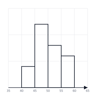
Construct a histogram for the following data representing weights of students: kg: 4 students, kg: 12 students, kg: 8 students, kg: 6 students.
Solution:
- Plot Weight on the x-axis starting from 40 (use a kink/zigzag line if necessary).
- Plot Number of Students on the y-axis.
- Draw rectangles with heights corresponding to the frequencies. Rectangle heights: is 4, is 12, is 8, is 6.
Explanation:
Since the class intervals are continuous and have the same width, the area of each rectangle is proportional to its frequency.
Problem 4:
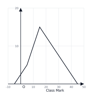
Represent the following data using a frequency polygon: Class (Freq: 5), (Freq: 15), (Freq: 10), (Freq: 5).
Solution:
- Find class marks: .
- Points to plot: .
- Include imaginary classes: and .
- Connect points with straight lines.
Explanation:
The frequency polygon is a closed figure, so we connect the ends to the horizontal axis at the mid-points of the preceding and succeeding empty classes.