
Statistics and Probability - Statistical Diagrams (Bar Charts, Pie Charts, Histograms)
Review the key concepts, formulae, and examples before starting your quiz.
🔑Concepts
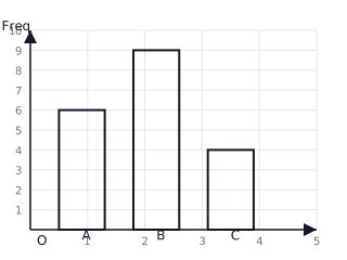
Bar charts use discrete bars to represent the frequency of categorical or discrete data. The height (or length) of each bar is proportional to the frequency it represents. The bars should be of equal width and separated by equal gaps.
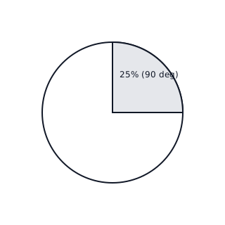
Pie charts represent parts of a whole using sectors of a circle. The angle of each sector is calculated by the formula . The sum of all sector angles must always equal .
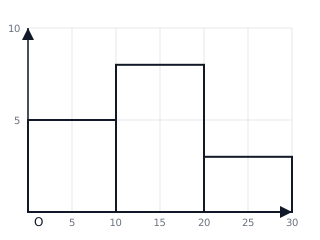
Histograms represent continuous data. Unlike bar charts, there are no gaps between bars if the data is continuous. The area of the bar represents the frequency. For equal class widths, the height corresponds to frequency; for unequal widths, height equals frequency density.
Frequency polygons are created by joining the midpoints of the tops of the bars in a histogram or bar chart with straight lines. They help in visualizing the trend and distribution of the data set.
📐Formulae
(Used for advanced histograms)
💡Examples
Problem 1:
A survey of 60 students asked for their favorite color. 15 students chose 'Blue'. Calculate the angle this sector would occupy on a pie chart.
Solution:
Angle = (15 / 60) * 360° = 0.25 * 360° = 90°
Explanation:
To find the angle, divide the specific frequency by the total frequency to find the fraction of the circle, then multiply by 360 degrees.
Problem 2:
In a histogram representing the heights of plants, the class interval '10 < h ≤ 20' has a frequency of 8 and the class interval '20 < h ≤ 30' has a frequency of 12. What is the total number of plants measured in these two intervals?
Solution:
Total = 8 + 12 = 20 plants
Explanation:
In a basic histogram where class widths are equal, the frequency is simply the height of the bars. Adding the frequencies of the required intervals gives the total count.
Problem 3:
A bar chart shows that 5 people have 0 pets, 8 people have 1 pet, and 2 people have 2 pets. Calculate the total number of pets owned by this group.
Solution:
Total Pets = (5 * 0) + (8 * 1) + (2 * 2) = 0 + 8 + 4 = 12 pets
Explanation:
To find the total quantity from a frequency distribution, multiply each value (number of pets) by its frequency (number of people) and sum the results.
Problem 4:
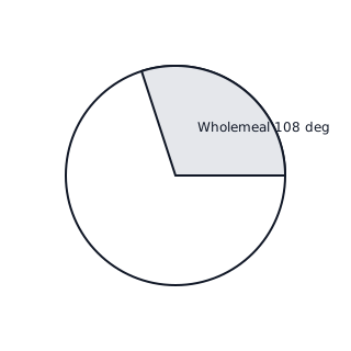
A baker sells 4 types of bread: White, Wholemeal, Rye, and Sourdough. The sales are represented in a pie chart. If the angle for 'Wholemeal' is and the total number of loaves sold is 120, how many 'Wholemeal' loaves were sold?
Solution:
- Use the ratio of the sector angle to the total angle ().
Explanation:
Since the full circle represents the total sales of 120 loaves, the proportion of the circle occupied by Wholemeal (108/360) tells us the proportion of the total loaves that were Wholemeal.
Problem 5:
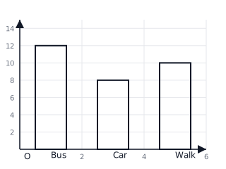
Draw a bar chart for the following survey of student transport: Bus (12), Car (8), Walk (10). Determine the total number of students surveyed.
Solution:
- Sum the frequencies for all categories.
- Draw bars with heights 12, 8, and 10 respectively.
Explanation:
The total number of students is the sum of the frequencies of each category shown on the y-axis of the bar chart.