
Review the key concepts, formulae, and examples before starting your quiz.
🔑Concepts
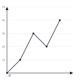
Data can be organized and visualized using different types of graphs. A Line Graph is particularly useful for showing how data changes continuously over a period of time, such as temperature variations or distance covered by a vehicle.
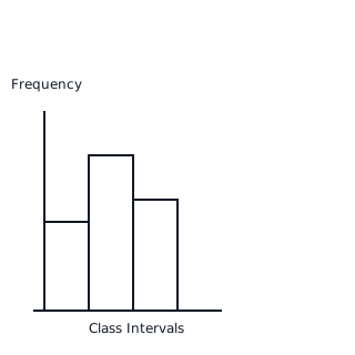
A Histogram is used for representing grouped frequency distributions where the data is continuous. There are no gaps between the bars, and the area of each bar represents the frequency of the corresponding class interval.
A Pie Chart or a Circle Graph shows the relationship between a whole and its parts. The size of each sector is proportional to the information it represents, calculated using the central angle formula.
Double Bar Graphs are used to compare two sets of data simultaneously. For example, comparing the marks of a student in two different terms across various subjects.
📐Formulae
💡Examples
Problem 1:
In a class of students, like Mathematics, like Science, and like English. Calculate the central angle for Mathematics to represent this data on a Pie Chart.
Solution:
Total number of students = . Number of students who like Mathematics = .
Explanation:
To find the central angle, we divide the frequency of the specific component by the total frequency and multiply by the total degrees in a circle ().
Problem 2:
A die is thrown once. What is the probability of getting a prime number?
Solution:
Total outcomes when a die is thrown: . So, total outcomes = . Prime numbers on a die: . So, number of favorable outcomes = .
Explanation:
The probability is calculated by identifying the subset of prime numbers within the sample space of a six-sided die.
Problem 3:
Find the class mark and class size for the class interval .
Solution:
Lower Limit = , Upper Limit = .
Explanation:
Class size is the difference between the limits, while the class mark is the midpoint (average) of the limits.
Problem 4:
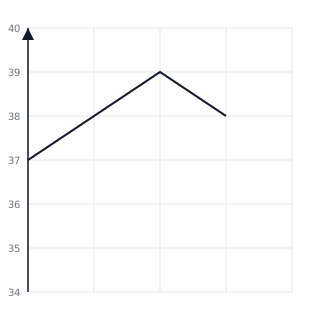
The following line graph shows the temperature of a patient in a hospital recorded every hour. At what time was the patient's temperature ?
Solution:
Explanation:
Look at the y-axis (Temperature) and find the point between and . Move horizontally to the right to find the corresponding point on the line. Then, move vertically down to the x-axis to find the time. The point lies exactly midway between PM and PM.
Problem 5:
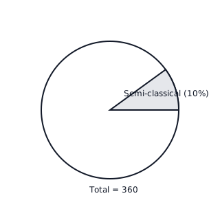
A survey of people was made to find the type of music they like. If of the people like Semi-classical music, how many people were surveyed who liked this type?
Solution:
Explanation:
The percentage represents a part of the whole ( people). By multiplying the decimal or fractional form of the percentage by the total population, we find the specific count for that category.