
Review the key concepts, formulae, and examples before starting your quiz.
🔑Concepts
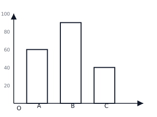
A Bar Graph is a visual representation of data using rectangular bars of uniform width, where the height or length of each bar is proportional to the value it represents. The bars are usually drawn with equal gaps between them.
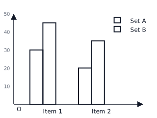
Double Bar Graphs are used to compare two different sets of data on the same categories simultaneously. For example, comparing the rainfall in two different years for the same months. A legend (key) is used to differentiate between the two data sets.
The Scale of a graph is the ratio used to represent large numbers with smaller units on the axis. For example, if , then a bar of represents students.
Interpretation involves reading the graph to find the minimum value, maximum value, and the difference between categories. It helps in making predictions and identifying trends in the data.
📐Formulae
💡Examples
Problem 1:
The number of books sold by a library in four days is: Monday: , Tuesday: , Wednesday: , and Thursday: . If the graph is drawn with a scale of , calculate the height of the bar for Wednesday and find the range of books sold.
Solution:
- To find the height of the bar for Wednesday:
- To find the range:
Explanation:
The height of the bar is calculated by dividing the data value by the chosen scale. The range provides the difference between the highest and lowest values in the data set.
Problem 2:
In a double bar graph comparing the marks of Rahul in Term 1 and Term 2: Maths (Term 1: , Term 2: ), Science (Term 1: , Term 2: ), and English (Term 1: , Term 2: ). Calculate the total marks for Term 2 and the improvement in Maths.
Solution:
- Total marks for Term 2:
- Improvement in Maths:
Explanation:
For a double bar graph, we extract the values for one specific data series (Term 2) by identifying its corresponding bars using the legend, and then sum them. Improvement is the positive difference between the two terms.
Problem 3:
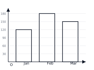
The following table shows the number of cycles sold by a shopkeeper over three months: January: , February: , and March: . Draw a bar graph and determine which month had sales times that of January.
Solution:
- Let's choose a scale: .
- Height for January = .
- Height for February = .
- Height for March = .
- Sales for Jan = . . February has sales.
Final Answer: February.
Explanation:
By comparing the height of the bars, we see February is units high while January is units. Since , the visual confirms the calculation.
Problem 4:
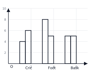
A school sports day tracks the number of Gold medals won by two houses in three sports: Cricket (House A: , House B: ), Football (House A: , House B: ), and Basketball (House A: , House B: ). Use a double bar graph to identify in which sport House B performed better than House A.
Solution:
- Comparing categories:
- Cricket: House B () > House A ().
- Football: House A () > House B ().
- Basketball: House A () = House B ().
- From the graph, the bar for House B is higher than House A only in Cricket.
Final Answer: Cricket.
Explanation:
In a double bar graph, we look for categories where the second bar (House B) is taller than the first bar (House A).