
Statistics and Probability - Representing Data (Bar Charts, Pie Charts, Line Graphs, Stem-and-Leaf Diagrams)
Review the key concepts, formulae, and examples before starting your quiz.
🔑Concepts
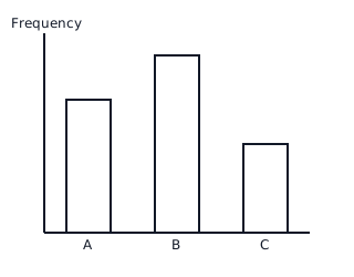
Bar charts are used to compare categorical data. The height of each bar represents the frequency of that category, and gaps are kept between bars to show categories are distinct.
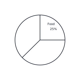
Pie charts represent parts of a whole using sectors of a circle. The angle of each sector is proportional to the frequency of the category, calculated as .
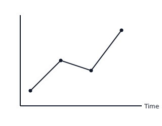
Line graphs are typically used to show trends or changes over a continuous interval of time. Data points are plotted and connected by straight line segments.
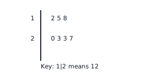
Stem-and-leaf diagrams organize numerical data while maintaining individual values. The 'stem' represents the tens (or higher digits) and 'leaves' represent the units digits. It must always include a key.
📐Formulae
💡Examples
Problem 1:
A class of students was surveyed about their favorite fruit. chose Apple, chose Banana, and chose Orange. Calculate the angle for each sector to draw a pie chart.
Solution:
Step 1: Identify total frequency (). Step 2: Calculate angle for Apple: . Step 3: Calculate angle for Banana: . Step 4: Calculate angle for Orange: . Step 5: Check total: .
Explanation:
To represent data on a pie chart, we convert the frequency of each category into a proportional part of a full circle ().
Problem 2:
Represent the following test scores in a Stem-and-Leaf diagram and find the median: .
Solution:
Step 1: Create the stems (tens place) and leaves (units place). Stem : Stem : Stem : Step 2: Add a Key: . Step 3: Find the median. Since there are values, the median is the value. Step 4: Counting through the leaves: the value is .
Explanation:
The stem-and-leaf plot organizes the data in order. The median is the middle value of the ordered data set.
Problem 3:
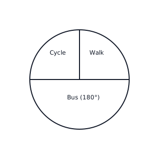
A group of students were asked how they travel to school. walk, take the bus, and cycle. Represent this information as a pie chart and find the angle for the 'Bus' sector.
Solution:
Explanation:
To find the angle for each sector, divide the frequency by the total frequency and multiply by (the total degrees in a circle). Since the bus represents half the total students (), it occupies exactly half the circle ().
Problem 4:
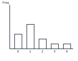
The following numbers represent the number of goals scored by a team in 12 matches: . Create a frequency bar chart for this data.
Solution:
First, count frequencies:
- goals: times
- goal: times
- goals: times
- goals: time
- goals: time
Explanation:
Identify the distinct values (0, 1, 2, 3, 4) to put on the horizontal axis and count how many times each value occurs (frequency) for the vertical axis heights.