
Review the key concepts, formulae, and examples before starting your quiz.
🔑Concepts
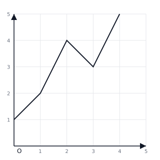
Line graphs are used to show how a specific quantity changes over a continuous period of time. Data points are plotted and then connected by straight lines to reveal trends such as increases, decreases, or stability.
A Pie Chart (or Circle Graph) represents data as 'slices' of a whole circle. Each slice (sector) shows the relative size of a category compared to the total sum of all categories.
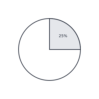
The size of a sector in a pie chart is determined by the central angle. Since a full circle is , a category that represents half the data will have an angle of .
When interpreting line graphs, look for the 'slope' of the lines. A line going upwards from left to right indicates an increase, while a line going downwards indicates a decrease.
📐Formulae
💡Examples
Problem 1:
A line graph shows the temperature in a classroom recorded over three hours. At AM it was , at AM it was , and at AM it was . What was the change in temperature between AM and AM, and what was the overall trend from AM to AM?
Solution:
Step 1: Identify the values. and . Step 2: Calculate the difference: . The temperature increased by . Step 3: Observe the trend from AM to AM. Since the value went from to , the line on the graph moves downwards, indicating a 'decreasing' trend.
Explanation:
To find the change, we subtract the earlier value from the later value. To identify a trend, we look at whether the line segments are sloping upwards (increase) or downwards (decrease).
Problem 2:
In a class of students, students chose 'Blue' as their favorite color. If you were drawing a pie chart to represent this data, what would be the angle of the sector for 'Blue'?
Solution:
Step 1: Identify the part and the whole. Part , Total . Step 2: Use the formula for the sector angle: . Step 3: Simplify the fraction: . Step 4: Multiply by the total degrees: .
Explanation:
To find the angle of a pie chart slice, we first determine what fraction of the whole the category represents, then multiply that fraction by the that make up a full circle.
Problem 3:
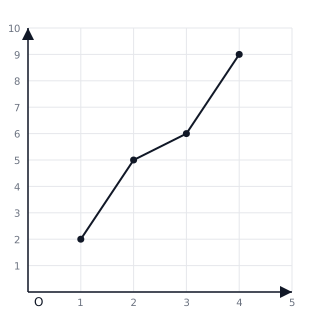
A plant's height was measured every Monday for 4 weeks. On Week 1 it was cm, Week 2 it was cm, Week 3 it was cm, and Week 4 it was cm. Plot this data on a line graph. What was the growth between Week 1 and Week 4?
Solution:
Explanation:
To find the total growth, we subtract the initial height in Week 1 ( cm) from the final height in Week 4 ( cm). The result is cm.
Problem 4:
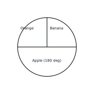
A surveyor asked people about their favorite fruit. people chose Apple, chose Banana, and chose Orange. Calculate the angle for the 'Apple' sector in a pie chart.
Solution:
Explanation:
The 'Apple' category accounts for out of total responses, which is of the total. Half of a full circle is .