
Review the key concepts, formulae, and examples before starting your quiz.
🔑Concepts
A Pictograph uses pictures or symbols to represent data. A 'Key' is essential to tell us what each picture stands for. For example, if smiley face represents students, then smiley faces represent students.
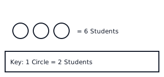
A Bar Chart represents data using rectangular bars of different heights or lengths. The height of each bar corresponds to the value it represents on the vertical axis (Y-axis).
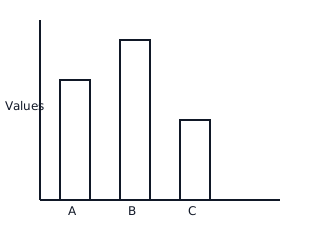
Tally Marks are a quick way of recording data in groups of . We draw four vertical lines and the fifth line crosses through them diagonally.

Data Interpretation involves reading the charts to find the 'Most Popular' (highest bar/most symbols) or 'Least Popular' (lowest bar/fewest symbols) items.
📐Formulae
💡Examples
Problem 1:
In a pictograph, a symbol of a star represents points. If Rohan has star symbols next to his name, how many points did he score?
Solution:
Step 1: Identify the value of one symbol from the key. . Step 2: Count the total number of stars Rohan has, which is . Step 3: Multiply the number of symbols by the value per symbol: .
Explanation:
To find the total points, we use the scale provided in the key and multiply it by the count of symbols visible on the chart.
Problem 2:
A bar chart shows that students like Mango and students like Apple. How many more students like Mango than Apple?
Solution:
Step 1: Find the value for Mango, which is . Step 2: Find the value for Apple, which is . Step 3: Subtract the smaller number from the larger number to find the difference: .
Explanation:
The phrase 'how many more' tells us to find the difference between two categories. We look at the heights of the two bars and subtract the smaller value from the larger one.
Problem 3:
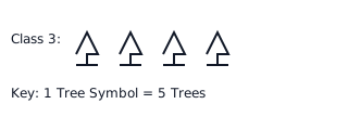
The following pictograph shows the number of trees planted by different classes. If each tree symbol represents trees, how many trees were planted by Class 3 in total?
Solution:
From the pictograph, Class 3 has tree symbols. Since symbol trees, Total trees . Class 3 planted trees.
Explanation:
To find the total, we count the number of symbols for Class 3 and multiply it by the value given in the key ().
Problem 4:
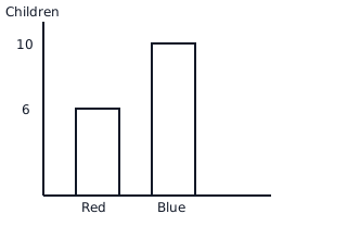
Look at the bar chart showing the favorite colors of a group of children. How many more children like Blue than Red?
Solution:
- Number of children who like Blue
- Number of children who like Red
- Difference more children like Blue than Red.
Explanation:
We identify the values of the bars for Blue and Red on the vertical axis and subtract the smaller value from the larger one.