
Review the key concepts, formulae, and examples before starting your quiz.
🔑Concepts
Cumulative frequency is a running total of frequencies. When plotted against the upper class boundary, it forms an 'S-shaped' curve called an ogive, used to estimate the median (), lower quartile (), and upper quartile ().
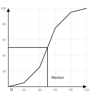
A Box Plot (or Box-and-Whisker Plot) provides a visual summary of a data set using five key values: the Minimum, , Median, , and the Maximum. The 'box' represents the Interquartile Range (IQR).
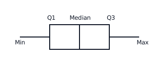
The Interquartile Range (IQR) measures the spread of the middle 50% of the data. It is calculated as . A smaller IQR indicates that the data is more consistent.
Comparison of distributions: When comparing two box plots, look at the position of the median (average) and the width of the box (consistency/spread).
📐Formulae
Interquartile Range (IQR) = Q_3 - Q_1
💡Examples
Problem 1:
In a survey of 80 students, their heights (h cm) were recorded. The cumulative frequency table shows: , , , . Estimate the Median and the Interquartile Range.
Solution:
- Total frequency () = 80.
- Median position = . Looking at the cumulative frequency, 40 falls between 160 and 170. By linear interpolation or reading a curve, Median cm.
- position = . Since 20 falls in the class, cm.
- position = . Since 60 falls in the class, cm.
- cm.
Explanation:
To estimate these values, we locate the specific rank (20th, 40th, 60th) on the cumulative frequency (y-axis), move horizontally to the curve, and then vertically down to the height (x-axis).
Problem 2:
Given the following summary for a set of test scores: Min = 20, , Median = 55, , Max = 95. How is this represented on a Box Plot?
Solution:
- Draw a horizontal scale from 20 to 100.
- Draw a rectangular box from 45 to 70.
- Draw a vertical line inside the box at 55.
- Draw 'whiskers' (lines) extending from the box at 45 down to 20, and from 70 up to 95.
Explanation:
The box represents the Interquartile Range (central of the data), the line inside shows the average (median), and the whiskers show the full extent (range) of the data set.
Problem 3:
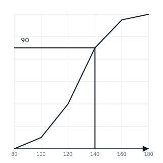
The weights of 120 apples were recorded. The cumulative frequency graph is shown below. Use the graph to estimate the number of apples weighing more than .
Solution:
- Locate on the x-axis (horizontal axis).
- Move vertically to the curve and then horizontally to the y-axis.
- The cumulative frequency at is 90.
- Total apples .
- Number of apples weighing more than is .
Explanation:
To find values 'greater than' a certain point, subtract the cumulative frequency value at that point from the total frequency ().
Problem 4:
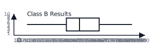
Two classes took the same math test. Class A's results are summarized as: Min=30, , Med=60, , Max=95. Class B's results are shown in the box plot. Which class performed better on average, and which class had more consistent results?
Solution:
- Class A Median = 60. Class B Median = 50 (from diagram).
- Class A performed better on average because .
- Class A . Class B .
- Class B was more consistent because its IQR (25) is smaller than Class A's IQR (30).
Explanation:
Better average performance is indicated by a higher median. Consistency is indicated by a smaller Interquartile Range (the width of the box).