
Review the key concepts, formulae, and examples before starting your quiz.
🔑Concepts
A Histogram is a graphical representation of a frequency distribution using adjacent rectangles. The width represents the class interval and the height represents the frequency. For unequal class widths, heights must be adjusted using the formula:
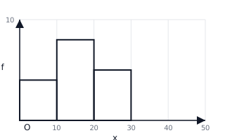
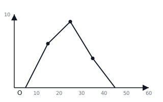
A Frequency Polygon is formed by joining the mid-points (class marks) of the tops of the histogram rectangles. To complete the polygon, the ends are joined to the mid-points of the preceding and succeeding empty classes on the x-axis.
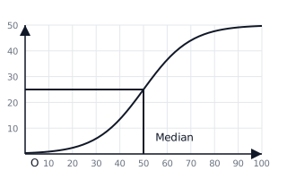
An Ogive (Cumulative Frequency Curve) is a smooth curve drawn by plotting upper class limits against cumulative frequencies. It is used to find partition values like the Median, , and . To find the Median, locate the term on the y-axis, move horizontally to the curve, and then vertically down to the x-axis.
When class intervals are inclusive (e.g., 10-19, 20-29), they must be converted to exclusive form (9.5-19.5, 19.5-29.5) using an adjustment factor before drawing any graph. This ensures continuity on the x-axis.
📐Formulae
💡Examples
Problem 1:
Draw a histogram for the following distribution and find the Mode graphically:
| Class | 0-10 | 10-20 | 20-30 | 30-40 | 40-50 |
|---|---|---|---|---|---|
| Freq | 5 | 12 | 20 | 15 | 8 |
Solution:
- Plot the class intervals on the x-axis.
- Plot frequencies on the y-axis (Scale: ).
- Construct rectangles for each class with heights and .
- Identify the modal class: (tallest rectangle, height ).
- Draw a line from the top-left corner of the rectangle to the top-left corner of the rectangle.
- Draw another line from the top-right corner of the rectangle to the top-right corner of the rectangle.
- Locate the intersection point of these two diagonal lines.
- Draw a perpendicular line from this intersection to the x-axis. The value on the x-axis is approximately .
.
Explanation:
The mode is found by examining the area of highest frequency. The intersection of the diagonal lines accounts for the influence of the frequencies of classes immediately preceding and following the modal class.
Problem 2:
Given the following frequency distribution, draw an Ogive and estimate the Median:
| Marks | 10-20 | 20-30 | 30-40 | 40-50 | 50-60 |
|---|---|---|---|---|---|
| Students | 4 | 9 | 15 | 10 | 2 |
Solution:
- Calculate Cumulative Frequencies ():
- Points to plot : .
- Include the starting point: .
- Plot these points on a graph and join them with a smooth freehand curve.
- Total frequency . Median position term.
- On the y-axis, find the value . Draw a horizontal line to the Ogive.
- From the intersection point on the Ogive, drop a vertical line to the x-axis. The value on the x-axis is the Median marks.
Explanation:
The Ogive represents the cumulative distribution. By finding the middle point of the total frequency () on the y-axis, we can trace back to the x-axis to find the value below which of the data lies.
Problem 3:
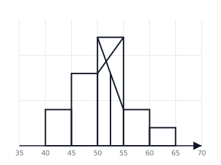
Draw a histogram for the following frequency distribution of weights of 30 students and use it to estimate the mode:
Identify the modal class and find the mode from the graph.
Solution:
- Convert the data into a histogram where the x-axis is Weight and the y-axis is Frequency.
- The modal class is as it has the highest frequency ().
- To find the mode graphically: a. Join the top-right corner of the modal bar to the top-right corner of the preceding bar. b. Join the top-left corner of the modal bar to the top-left corner of the succeeding bar. c. The x-coordinate of the intersection point of these two lines is the Mode.
- From the graph, the Mode kg.
Explanation:
Mode is the value of the variable which has the maximum frequency. In a histogram, the tallest rectangle represents the modal class. The intersection of diagonals drawn from the corners of the adjacent bars provides a reliable estimate of the mode.
Problem 4:
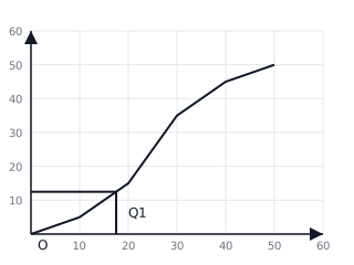
For the following data, draw a 'less than' ogive and estimate the Lower Quartile ():
Total frequency .
Solution:
- Calculate Cumulative Frequencies (CF):
- Plot the points and join them with a free-hand curve.
- The total frequency .
- Position of Lower Quartile () = term.
- On the y-axis, locate . Draw a horizontal line to meet the curve, then a vertical line down to the x-axis.
- marks.
Explanation:
Quartiles divide the data into four equal parts. is the value below which 25% of the data falls. By using the cumulative frequency curve, we can interpolate this value between class boundaries.