
Review the key concepts, formulae, and examples before starting your quiz.
🔑Concepts
Data types and variables: Scientific enquiry involves identifying the independent variable (the one you change), the dependent variable (the one you measure), and control variables (those kept constant to ensure a fair test). Data can be qualitative (descriptive) or quantitative (numerical).

Lines of best fit: A line of best fit represents the general trend of data points on a scatter graph. It does not necessarily touch every point but should have an equal distribution of points above and below it. Anomalous results (outliers) should be ignored when drawing this line.
Identifying Relationships: Graphs allow us to see correlations. A positive correlation occurs when both variables increase together. A negative correlation occurs when one variable increases as the other decreases. No correlation means there is no clear pattern.
Reading Scales and Intercepts: When plotting graphs, the independent variable is placed on the -axis and the dependent variable on the -axis. The intercept is the point where the line crosses an axis, often providing physical meaning, such as starting temperature or initial mass.
📐Formulae
💡Examples
Problem 1:
A student measures the extension of a spring with different weights. The results for of force are , , and . Calculate the mean extension.
Solution:
Explanation:
The value is an anomaly as it is significantly different from the other two results. It is excluded from the calculation. The sum of the remaining values () is divided by the count of valid values ().
Problem 2:
Identify the independent and dependent variables in an experiment where a scientist measures how the volume of gas produced changes over time.
Solution:
Independent Variable: Time (); Dependent Variable: Volume of gas ()
Explanation:
The scientist chooses the intervals of time to take measurements (Independent), and the volume of gas depends on how much time has passed (Dependent).
Problem 3:
On a graph, the -coordinates for two points on a line of best fit are and , while the -coordinates are and . Calculate the gradient.
Solution:
Explanation:
The gradient is calculated by dividing the vertical change (rise) by the horizontal change (run) between two points on the line.
Problem 4:
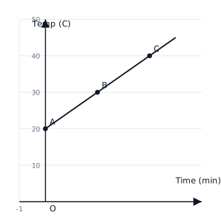
A student monitors the temperature of a beaker of water as it is heated over a Bunsen burner. The temperature is recorded every minute. At , the temperature is . At , the temperature is , and at , it is . Use a line graph to determine the rate of temperature increase (the gradient).
Solution:
Explanation:
The rate of change in a linear relationship is represented by the gradient of the line of best fit. By taking two points from the data, and , we calculate the change in temperature divided by the change in time.
Problem 5:
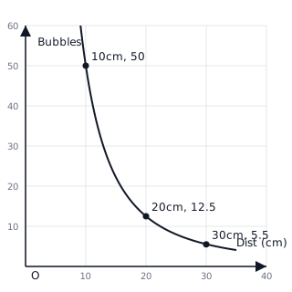
During an experiment on photosynthesis, a scientist counts the number of bubbles produced by a water plant at different distances from a light source. At , the bubble count is . At , the count is . At , the count is . Plot these points to visualize the relationship between distance and the rate of photosynthesis.
Solution:
The graph shows a non-linear relationship where the number of bubbles decreases as the distance increases. This follows the inverse square law relationship:
Explanation:
In data analysis, a curve suggests that the dependent variable (bubbles) is not changing at a constant rate relative to the independent variable (distance). As distance increases, the light intensity drops significantly, reducing the rate of photosynthesis.